You are using an out of date browser. It may not display this or other websites correctly.
You should upgrade or use an alternative browser.
You should upgrade or use an alternative browser.
New Sponsor. Place your bets (2 Viewers)
- Thread starter jordan210
- Start date
Can’t see any Council owned organisation having anything to do with CCFC at the moment, plus given how hard the gym and leisure industry have been affected by COVID, they would have very little money to spend on sponsorship.How about The Wave? Got a decent logo, local to the city and would promote fitness etc.
I’d quite like to see The Coventry (Building Society) adorn the shirts
If we are getting a new sponsor, might this mean the 2-Tone shirts being reduced in price?
letsallsingtogether
Well-Known Member
BCC
Sky_Blue_Dreamer
Well-Known Member
Due to my love of stationery I hope we get Pen Island.
Nick
Administrator
It costs approx £200k a year to sponsor the home shirt for a team of our standing in the Championship
£320k for home and away kit
£60k for the shorts home and away
How the fuck would you know?
*Just for those who don't realise by the smileys, I am joking as he clearly would know.
LastGarrison
Well-Known Member
They most definitely do.Genuine question: do Warwick advertise? I can’t remember ever seeing it. I know Cov do, but do you have to when you’re as prestigious as Warwick?
Next time you fly into Birmingham and step off the plane onto the jet bridge see what advertising are on them.
The majority are Warwick Business School.
shmmeee
Well-Known Member
They most definitely do.
Next time you fly into Birmingham and step off the plane onto the jet bridge see what advertising are on them.
The majority are Warwick Business School.
Obviously I’m not classy enough to be in places they advertise
kapowaz
Well-Known Member
Personally I think Warwick Uni is a good shout; the partnership with the club for the stadium probably means they’re forging closer ties (if it’s not just hot air) and despite what many might think, a top uni (and Warwick is a top uni) draws students from far and wide. Coronavirus might mean plans for the next 12 months are somewhat disrupted, but it doesn’t mean they won't be taking any new applications in that period (which is the purpose of advertising for a university).
I still think it’s more likely to be someone like 32Red, but Warwick Uni would be a classy organisation to have on the shirt. My only problem is the actual branding for the university is actually kind of poor (just check the survey results on this design site). The W is really boring and unoriginal, and the word WARWICK is set in an extremely weak thin sans-serif font that I suspect won’t stand out well on a shirt. I should mock it up on one of my templates to see how it looks.
I still think it’s more likely to be someone like 32Red, but Warwick Uni would be a classy organisation to have on the shirt. My only problem is the actual branding for the university is actually kind of poor (just check the survey results on this design site). The W is really boring and unoriginal, and the word WARWICK is set in an extremely weak thin sans-serif font that I suspect won’t stand out well on a shirt. I should mock it up on one of my templates to see how it looks.
Sky_Blue_Dreamer
Well-Known Member
God, it’s really quite an awful logo. Just doesn’t work well at all.
WMG might work a bit better.
kapowaz
Well-Known Member
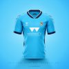
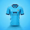
Assuming we have a plain, solid sky blue shirt that gives it the best contrast, but it’s just really poor. The text underneath is barely legible it’s so thin.

You can really see the problem if I shrink the image down — nothing except those two triangles is recognisable. Arguably this is even worse than Allsopp & Allsopp’s logo:

And yeah, I used white for aesthetic reasons, but it’s not much better in navy (i.e. the best contrast that’s hypothetically possible):


You can really see the problem if I shrink the image down — nothing except those two triangles is recognisable. Arguably this is even worse than Allsopp & Allsopp’s logo:

And yeah, I used white for aesthetic reasons, but it’s not much better in navy (i.e. the best contrast that’s hypothetically possible):

shmmeee
Well-Known Member
Assuming we have a plain, solid sky blue shirt that gives it the best contrast, but it’s just really poor. The text underneath is barely legible it’s so thin.
View attachment 16210
You can really see the problem if I shrink the image down — nothing except those two triangles is recognisable. Arguably this is even worse than Allsopp & Allsopp’s logo:
View attachment 16211
And yeah, I used white for aesthetic reasons, but it’s not much better in navy (i.e. the best contrast that’s hypothetically possible):
View attachment 16213
SO THIS IS SISUS PLAN HUH!? REBRAND US WARWICK FC!!!!????
NOPM!?!1!?!?
baldy
Well-Known Member
Assuming we have a plain, solid sky blue shirt that gives it the best contrast, but it’s just really poor. The text underneath is barely legible it’s so thin.
View attachment 16210
You can really see the problem if I shrink the image down — nothing except those two triangles is recognisable. Arguably this is even worse than Allsopp & Allsopp’s logo:
View attachment 16211
And yeah, I used white for aesthetic reasons, but it’s not much better in navy (i.e. the best contrast that’s hypothetically possible):
View attachment 16213
To be honest I quite like these haha
mark82
Super Moderator
Assuming we have a plain, solid sky blue shirt that gives it the best contrast, but it’s just really poor. The text underneath is barely legible it’s so thin.
View attachment 16210
You can really see the problem if I shrink the image down — nothing except those two triangles is recognisable. Arguably this is even worse than Allsopp & Allsopp’s logo:
View attachment 16211
And yeah, I used white for aesthetic reasons, but it’s not much better in navy (i.e. the best contrast that’s hypothetically possible):
View attachment 16213
Take my money.
kapowaz
Well-Known Member
mark82
Super Moderator
Yeah, not so much the logo, but the shirt is nice.
Really intrigued to see what they come up with this year, and then whether they'll ruin it with some Chinese bookmaker logo.
LastGarrison
Well-Known Member
Not a chance I am afraid and they have already been making staff redundant.Personally I think Warwick Uni is a good shout; the partnership with the club for the stadium probably means they’re forging closer ties (if it’s not just hot air) and despite what many might think, a top uni (and Warwick is a top uni) draws students from far and wide. Coronavirus might mean plans for the next 12 months are somewhat disrupted, but it doesn’t mean they won't be taking any new applications in that period (which is the purpose of advertising for a university).
I still think it’s more likely to be someone like 32Red, but Warwick Uni would be a classy organisation to have on the shirt. My only problem is the actual branding for the university is actually kind of poor (just check the survey results on this design site). The W is really boring and unoriginal, and the word WARWICK is set in an extremely weak thin sans-serif font that I suspect won’t stand out well on a shirt. I should mock it up on one of my templates to see how it looks.
Warwick needed, pretty much, to grow their student population by roughly 10% each year in order to keep up with escalating costs.
COVID-19, plus Brexit mixed with a sprinkle of the Governments shift of focus to FE over HE means that pretty much all Uni’s are tightening their belts and, from what I hear, up to 30 are on the brink of going bust altogether.
sw88
Chief Commentator!
Coventry - City of Culture
oh wait hang on a minute!
I don’t think having COC on our shirts will be our best move!
Covskyblue
Active Member
Not a chance I am afraid and they have already been making staff redundant.
Warwick needed, pretty much, to grow their student population by roughly 10% each year in order to keep up with escalating costs.
COVID-19, plus Brexit mixed with a sprinkle of the Governments shift of focus to FE over HE means that pretty much all Uni’s are tightening their belts and, from what I hear, up to 30 are on the brink of going bust altogether.
“the Governments shift of focus to FE over HE”
have I missed something with regard to this, genuinely intrigued (I teach FE)
Users who are viewing this thread
Total: 3 (members: 0, guests: 3)

