You are using an out of date browser. It may not display this or other websites correctly.
You should upgrade or use an alternative browser.
You should upgrade or use an alternative browser.
New kit thread (6 Viewers)
- Thread starter Fergusons_Beard
- Start date
Evo1883
Well-Known Member
Sorry mate totally over my headInterest.....Bank.....Dad Joke.
Alkhen
Well-Known Member
The DHgate design team are going to absolutely butcher that embossed fabric. Cant see it'll be worth their time doing a bespoke fabric for the amount of orders they would getStraight on to DHGate
Senior Vick from Alicante
Well-Known Member
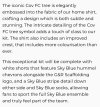
Love the kit and the link to the origins of our city name.
Despairing about the local history knowledge of our fan base!
Bit of an argument going on here about this. I was taught that the name comes from St Osburga who founded a nunnery along the Sherbourne (also St Osburgs off the ring round). Anglo Saxon pronunciation was Coventre which is Covent which meant convent and Tre which means settlement. I can understand thats hard to get on a shirt though.
HuckerbysQuiff
Well-Known Member
Lots of talk about embossed, but this looks debossed to me. Embossed is raised, which on close up photos doesn’t look like it is. Debossed is pressed down into material… guess you’ll only know when it’s in hand.
MatthewWallis
Well-Known Member
Yeah I mean the horrible design of them on last seasons kits
I mis read that on the video, thought we were having to wait until the 26/27 season"Available 26/7"
So everyone knows and can stop asking....
Saddlebrains
Well-Known Member
Absolutely class shirt
Ccfcisparks
Well-Known Member
Happy_Martian
Well-Known Member
Lots of talk about embossed, but this looks debossed to me. Embossed is raised, which on close up photos doesn’t look like it is. Debossed is pressed down into material… guess you’ll only know when it’s in hand.
It's neither. Just a change in stitch to show the pattern. Can't imagine Hummel getting a press tool cut to deboss the patterned areas specifically for us. That would boost the cost price dramatically.
Happy_Martian
Well-Known Member
Wonder how much this delightful garment will set us back ?
£60 ?
£70 ?
£60 ?
£70 ?
lewys33
Well-Known Member
As if someone photoshopped the 1990s CBS carpet on to the goalkeeper shirt as well as the away shirtView attachment 36816
Like it, was complaining last week we didnt take more risks with the GK shirts.
Hopefully the away one is fully mad
Liquid Gold
Well-Known Member
I'll just echo what everybody else has said, absolutely class shirt dodgy to have white shorts.
Skybluedownunder
Well-Known Member
Am I the only one who thinks the Monzo sponsorship should have been in red ?
The white against the sky blue (not reflex blue thank ****) doesn't stand out very well. Wonder how Monzo feel about it ?
Definitely on your own on that one lol.
Looks class with it being white
Sent from my iPhone using Tapatalk
HuckerbysQuiff
Well-Known Member
It's neither. Just a change in stitch to show the pattern. Can't imagine Hummel getting a press tool cut to deboss the patterned areas specifically for us. That would boost the cost price dramatically.
Probably bang on the money tbh… similar to the glued badge rather than stitched.
Not really a fan of this on first viewing, all a little boring for my liking. There’s some brilliant releases this season from Hummel & particularly Umbro can only hope the third shirt is a little more out there.
Skybluedownunder
Well-Known Member
Am I the only one who thinks the Monzo sponsorship should have been in red ?
The white against the sky blue (not reflex blue thank ****) doesn't stand out very well. Wonder how Monzo feel about it ?
Definitely on your own on that one lol.
Looks class with it being white
Sent from my iPhone using Tapatalk
RossB7
Well-Known Member
Hopefully navy to match what looked like navy chevrons on the leaked picture. That way we can swap about with white and navy shorts on both kits when needed. I think the home would look better with navy shorts anywayIf the home shorts are white, surely the away shorts won't be as well?
Hoofhearted
Well-Known Member
Anyone else seeing ET in the design???
HuckerbysQuiff
Well-Known Member
The release from club… also will be sky blue socksI missed the memo about the shorts being white, where has that come from?
edgy
Well-Known Member
I missed the memo about the shorts being white, where has that come from?
Thinking the same. Cant see any image of white shorts
HuckerbysQuiff
Well-Known Member
Liquid Gold
Well-Known Member
I'll just echo what everybody else has said, absolutely class shirt dodgy to have white shorts.
joemercersaces
Well-Known Member
I’m not generally a fan of football shirts, and being an old giffer, I usually hanker after the simplicity of the pre sponsorship era. And many sponsors are plain embarassing. But I really like this. Combines simplicity with a subtly complex background, a lovely colour and a sponsor with some hefty clout. I’ll get one.
A nod to F1 making up the trunk!
Users who are viewing this thread
Total: 7 (members: 0, guests: 7)


